Get a sneak peek of the upcoming Teamwork UI improvements
Posted by Teamwork Projects: Emma Ross / May 29, 2020
Over the next few days, you may notice that Teamwork will start looking much leaner and cleaner thanks to some new UI enhancements we’ll be rolling out.
These visual updates are designed to improve your experience in Teamwork and give more clarity to your workday. The cleaner, more simplified views will remove some of the noise to help you focus on the work that needs to get done. These UI improvements have been a big focus for us, because we’re committed to listening to your feedback and continuously improving your experience in Teamwork. We hope that these new additions help you to get more done, in less time. That said, your feedback on these changes is really important, so after you’ve had a few days to try them out, please let us know what you think over at support@teamwork.com. As well as design improvements, we’re also adding some time-saving enhancements, and we’ve recently added a new Planning area (which is already live!) to help streamline your workflow and make project planning and management a whole lot easier.
Let’s take a look at what UI improvements you can expect to see:
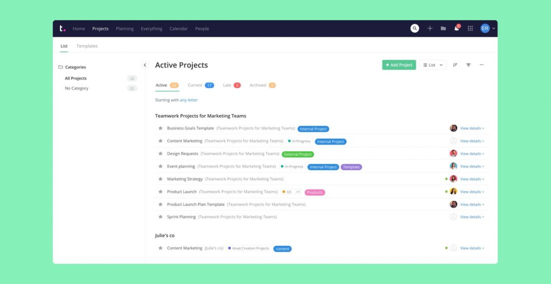
Streamlined Home and Projects views
The Home and Projects areas have been simplified by removing the project logo to create a more intuitive navigational experience when managing your projects. We have cleaned up Project Categories by removing the background colour and tweaking the look and feel of the collapse and expand icon. This will improve your Project view to offer a more unified experience making it easier to view and manage your Projects.

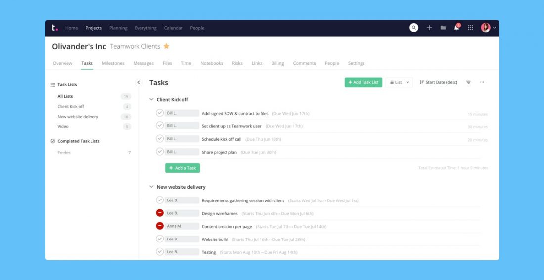
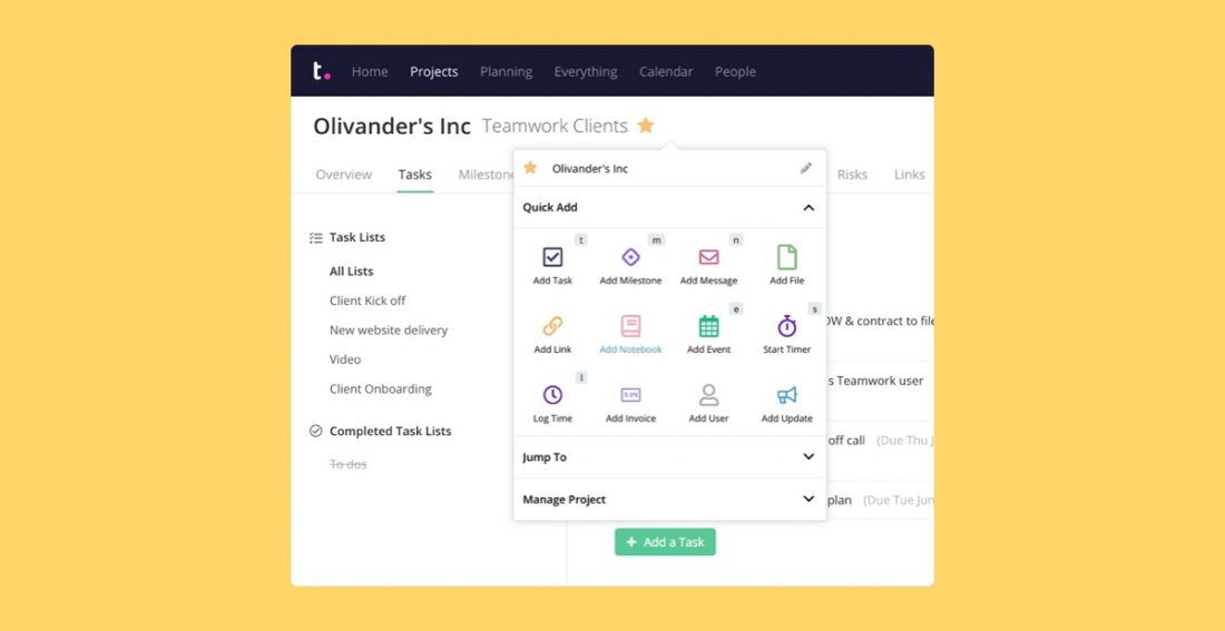
Improved project header
We’ve also made some visual improvements to the project title area by removing the navy background and replacing it with a cleaner white. Not only that, but you can now access more options from the dropdown here like Quick Add, Jump To, and Manage Project making it a more efficient way to manage your projects.
Improved Controls for Views and Filters
We know that consistency and simplicity are key when it comes to operating as efficiently as possible. As a result, we have updated the primary buttons to offer a more streamlined look and feel (without removing any functionality of course!). We have also redesigned our Filter, Sort By and Options buttons to offer a more consistent icon style. A more modern, single line button cluster frees up space in the interface to reduce distractions and improve your focus within Teamwork. We’ve also applied the same approach to our View Switcher, making it clearer and easier to switch from one view type to another.
Improved consistency
Continuing with the theme of consistency, we heard you and have now applied the same treatment to all top-level and sub-level navigations throughout the product. Whether you’re looking at People, Companies or Teams, you will now see a consistent interface making sure your time is spent on the job at hand with reduced background noise. You’ll see more design enhancements from tables to filters throughout Teamwork, and we’re excited to hear what you think. If you’ve got any feedback on what’s working (or isn’t) then we’d love to hear from you.
All new Planning area – now live!
Nestled between Projects and Everything, you’ll now find a new Planning tab. From here, you’ll get quick access to the tools you need to plan, manage, and track resources and progress throughout the project lifecycle, such as Workload, Project Portfolio, and the Project Chart.